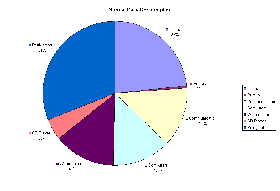


This graph shows a pie version of the central column of the consumption bars, and illustrates clearer than anything else the relationship between the various categories. The refrigerator alone is larger than any other category, while the pumps seem hardly relevant.
In the next version, I would like to add pie charts for maximum and minimum consumption as well. It would also be nice to make smaller pie charts for each category, to illustrate which lights consume so much power, for example.
Top Level: Home | Destinations | Cruising Info | Underwater | Boat Guests | Ocelot | Sue | Jon | Amanda | Chris | Site Map | Make a Comment
|
If our information is useful, you can help by making a donation |
Copyright © 2000‑ Contact: Jon and Sue Hacking -- HackingFamily.com, svOcelot.com. All rights reserved.